
Change theme and navigation
How do I change the application theme or navigation layout?
Use UI settings to make your own Synup workspace easier to read and navigate. Choose a light or dark whole-app theme, then choose a dark, light or compact navigation layout. Each choice applies immediately and is remembered by this browser—there is no Save button. These are personal browser preferences; they do not change your agency branding or a client's portal.
Key facts
- Access: this page is not currently listed in normal Settings navigation. While signed in, open
ai.synup.com/settings/uidirectly. - Theme choices: Light and Dark change the whole application's surface palette.
- Navigation choices: Standard (Dark), Standard (Light) and Compact change the left navigation's structure and appearance.
- No Save step: selecting a card applies that option immediately. The checked card is the current choice.
- Browser-specific: the preference is stored in the current browser and follows other tabs in that browser. It is not an account-wide setting.
Why this matters
The best layout is the one that keeps routine work comfortable and predictable. Dark surfaces can reduce glare, a light rail can blend into a bright workspace, and Compact navigation gives more structure when you move between many sections. Because these choices are personal, one teammate can use Compact with a dark theme without changing anyone else's experience.
Steps
While signed in to Synup, open
ai.synup.com/settings/ui. The page is currently available only through this direct Product address, not through the Settings menu.Under Theme, choose the palette you want:
- Light uses bright surfaces with dark text.
- Dark uses deep surfaces with light text.
Under Navigation, choose how the left side of the Product should work:
- Standard (Dark) uses a single dark sidebar with grouped sections. It is the current default.
- Standard (Light) keeps the same grouped single-column structure on light surfaces.
- Compact uses a two-column light layout with an icon rail and a secondary panel.
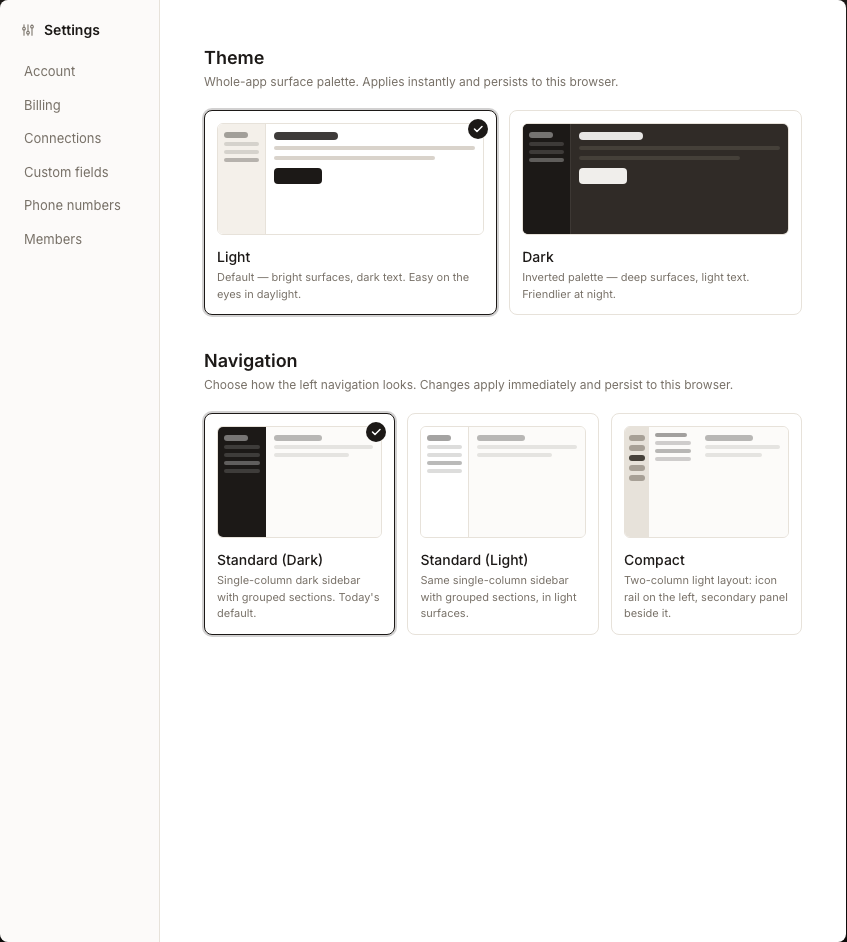
Continue working when the selected card gains its checkmark and the Product appearance changes. There is nothing else to submit.
What you'll see when it's done
- The selected theme and navigation cards show checkmarks.
- The application palette and left navigation update immediately.
- Reloading the Product in the same browser keeps the selected presentation.
Watch out for
Questions people ask
What should I check before I begin?
No agency configuration is required. Decide whether you want a light or dark working surface and whether you prefer a single-column or two-column navigation. Remember that the result is personal to this browser.
How will I know the workflow is complete?
The chosen card shows a checkmark, the interface changes immediately and the same choice returns after a reload in that browser. There is no saved-message or server-side completion state.
Next
To change what customers see rather than your own workspace, continue to agency branding or Client App branding.