
Interpret AI visibility trends
How do I interpret changes in AI visibility over time?
Potential customers may ask ChatGPT, Gemini, Perplexity, or another AI assistant which local business or service to choose. AI Visibility Trends helps you understand whether your business appears in those answers and how that visibility changes.
Use Trends to investigate the customer question: Am I becoming more visible when potential customers ask AI for recommendations, and where am I still being missed? Work through the evidence in this order:
- What changed in the overall AI Visibility score?
- Which answer engine is strongest, and which one still trails?
- Which prompt and citation evidence should guide the next improvement?
A strong overall gain is good news, but it does not mean every answer engine improved equally. Read the overall line first, compare engines over the same period, then use the supporting evidence to decide where to focus.
Start with the overall direction
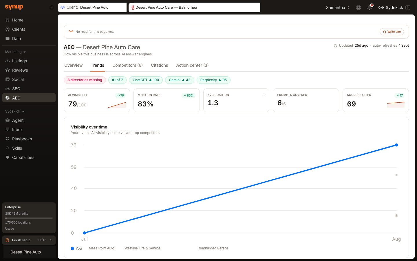
Desert Pine Auto Care has two useful monthly measurements. Overall AI Visibility moves from 0 in July to 79 in August. That is strong progress, and it establishes the direction of travel.
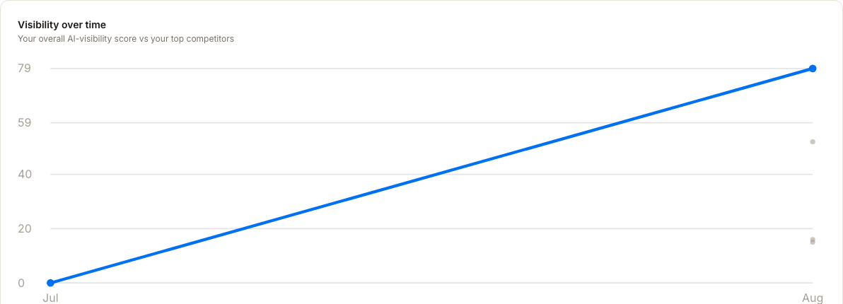
Use this chart to establish direction and scale. Then compare the engines before deciding that the work is complete.
Compare the answer engines
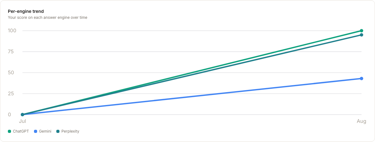
The same two months produce different outcomes by engine:
- ChatGPT improves from
0to100. - Perplexity improves from
0to95. - Gemini improves from
0to43.
All three engines improve, but Gemini trails the other two by more than 50 points. That makes Gemini the clearest remaining opportunity—not because the overall result is weak, but because the engine comparison shows where additional coverage is still available.
Confirm the gap with prompt coverage
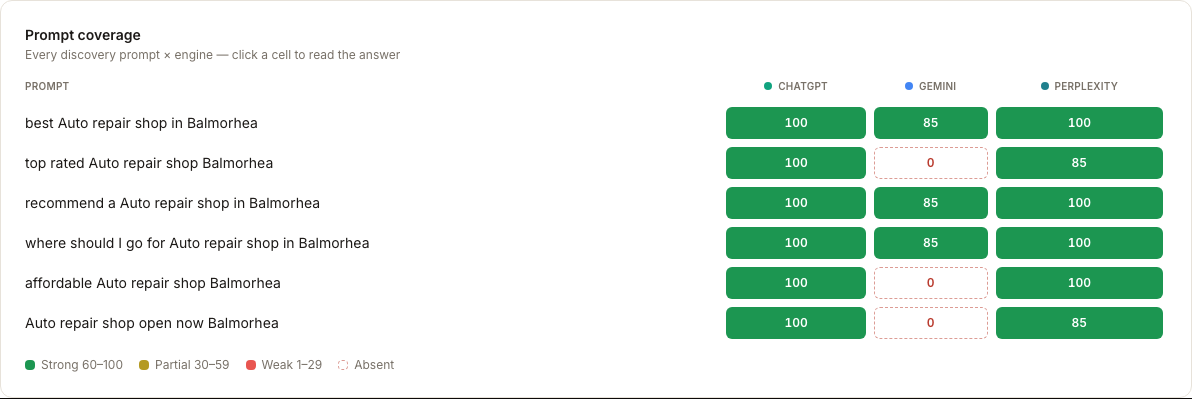
Return to Overview and compare the same six prompts across engines:
- ChatGPT covers
6/6prompts. - Perplexity covers
6/6prompts. - Gemini covers
3/6prompts.
A prompt is the kind of question a potential customer might ask an AI assistant while looking for a business like yours. In this report, Gemini surfaces the business for:
best Auto repair shop in Balmorhearecommend a Auto repair shop in Balmorheawhere should I go for Auto repair shop in Balmorhea
Gemini does not surface the business for:
top rated Auto repair shop Balmorheaaffordable Auto repair shop BalmorheaAuto repair shop open now Balmorhea
Those misses isolate three recognizable customer needs: reputation, price, and immediate availability. Start with those rows because they turn a broad engine-level difference into an exact investigation.
Use citation evidence as context
Cited sources increase from 52 to 69 over the same period. Open Citations to review the current source coverage and missing-directory opportunities alongside the Gemini prompt gaps.
The source increase is useful context, but it does not prove that citations caused the visibility gain. Treat prompts and citations as evidence to inspect before deciding whether content, source coverage, or another factor needs attention.
If this is the first monthly report
With only one stored point, Synup does not draw a trend. It explains that a new point is added automatically on the first of each month and offers See example so you can preview the chart's shape.
The example is labeled Example · projected, not your data. Use it only to understand the layout. It is not a forecast or expected performance.
Where to go next
- What does my AI Visibility score actually measure? — understand what each point counts
- How do I compare AI visibility across all my locations? — read the same signal across a portfolio