
Read the rank grid
How do I read the rank grid and switch between its views?
The grid on the Overview tab is a set of measuring points laid out in a 3×3, 5×5 or 7×7 square around your business, each coloured by where you ranked when someone searched from that spot. It exists because a single "we rank #4" is misleading — you can be first outside your front door and invisible farther away, and the grid is what shows you the difference.
Where the grid lives
Open SEO from the sidebar, pick one location, and stay on the Overview tab. The grid is the Grid Rank Report card.
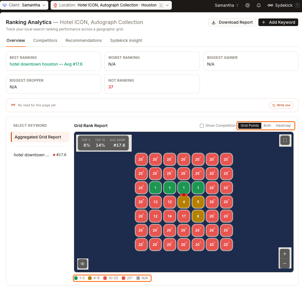
This captured 7×7 example is a downtown hotel searching on hotel downtown houston. It ranks first at four points near the property, second at another, slips to fifth, sixth and ninth farther out, reaches the teens after that, and falls outside the top 20 at most edges of the grid.
Two controls are worth finding before anything else, and both are boxed: the view switch beside the card heading, and the colour legend under the map.
One point, one search, one position
Each square is a real search Synup ran from that coordinate. The colour is your position in the local results:
| Colour band | Meaning |
|---|---|
1–3 | you're in the local pack |
4–9 | positions 4 through 9, shown in the amber band |
10–20 | positions 10 through 20, shown in the red band |
20⁺ | measured, and you weren't in the top 20 |
N/A | never measured — the lookup didn't return |
The last two rows are the ones people misread. 20⁺ is a result: Synup searched, you weren't there. N/A is an absence of a result, and it is left out of Top 3 %, Top 10 % and Avg Rank entirely, so a partly-measured grid never reports a coverage it doesn't have.
The next screenshot is a different business — a small bed and breakfast in Fairbanks, Alaska — because the Houston grid above can't show you this. Houston measured all 49 of its points, so it has no grey squares at all.

The two boxed squares are the whole distinction. The red one was measured and the business wasn't in the top 20. The grey one returned nothing. Only the red one reaches the numbers in the corner of the map.
Points that fall on water are a third case. Synup measures and stores them like any other point but, by default, does not draw or count them. That is why this captured Fairbanks grid draws 45 squares rather than 49 — four of its points landed on water.
The Water points checkbox appears above the map only when the grid actually has some, which is why you can see it on this Fairbanks example and not on the Houston one. It is also not a view toggle: ticking it saves a setting on the location, so the map and the Top 3 %, Top 10 % and Avg Rank figures all change, for everyone who opens the page afterwards.
Three ways to look at the same data
The buttons above the map are Grid Points, Both and Heatmap.
Grid Points
- Shows
- One coloured square per measured coordinate
- Use it when
- You want to read individual positions and click into a specific point
Heatmap
- Shows
- The same ranks as a smooth gradient of strength
- Use it when
- You want to see the shape of your coverage — where it falls away, and in which direction
Both
- Shows
- The gradient with the squares drawn over it
- Use it when
- You want the overall shape and the exact numbers at once
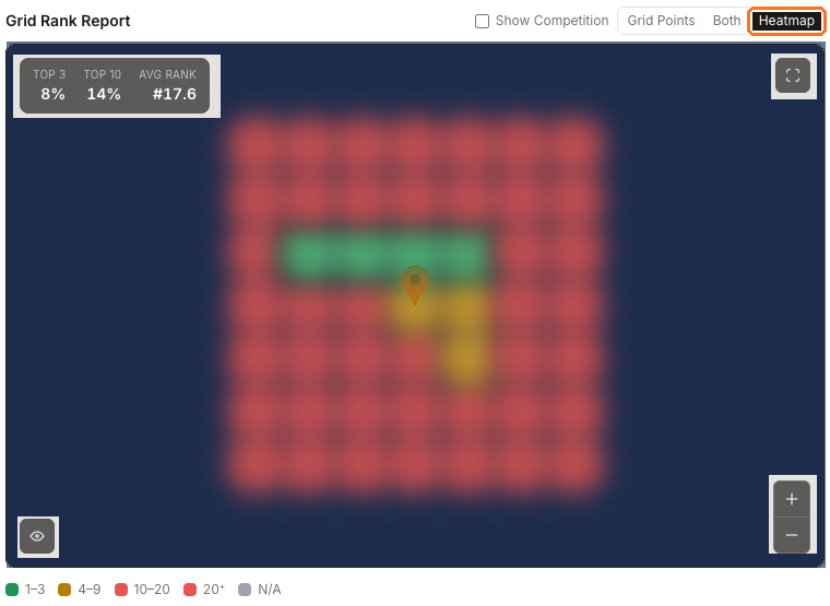
Heatmap is the one that's hard to picture from a description. This is the Houston hotel again, the same report as the first screenshot: the green center is its Top 3 pocket, amber shows nearby positions 4 through 9, and the red outer grid is weaker. Read this way you stop counting individual numbers and start seeing the shape — a strong core that falls away fast in every direction.
Show Competition adds pins for the businesses holding positions in your grid, each labelled with its best rank. It works on a single keyword, not the aggregated view — pick a keyword first, or the map just tells you to.
One keyword, or all of them
Select Keyword on the left lists your tracked keywords with their averages, plus Aggregated Grid Report at the top.
The aggregated view takes the best rank found at each point across every keyword, so it answers "how visible am I here at all". A single keyword answers "how visible am I here for this search". Diagnose with a single keyword; report progress with the aggregate.
With only one keyword tracked, the aggregated view and that keyword's own grid are the same picture.
Clicking a point on a single keyword's grid hands that coordinate to Sydekick, already scoped to the right client and location. You get the businesses that actually returned there with their ratings and review counts, a plain statement of whether you were among them, a short read of why, and a couple of suggested next actions. The aggregated view deliberately withholds that hand-off, because a cell that came from "whichever keyword did best here" has no single keyword to reason about.
Watch out for
- A grid full of
20⁺is a real answer, not a failed report. It means the business isn't reaching the top 20 anywhere measured. The Competitors and Recommendations tabs are where you find out what to do about it. - Lots of
N/Ameans thin coverage, and it changes how much the averages are worth. Check the no data count on the Not Ranking card before you read too much into a Top 3 %.
Questions people ask
Why does this grid have 49 points?
This example uses the 7×7 size. The add-keyword setup also supports 3×3 and 5×5 grids. You control how far apart the points sit — and therefore how much ground the grid covers — with the spacing slider when you add the keyword.