
Read Review Analytics
What should I actually look at in Review Analytics?
Open Reviews → Review Analytics for a location. The four tiles across the top tell you what is happening, and vs agency average further down tells you whether that is good or bad for your portfolio. Between them they answer does this location need me today?
Everything else on the page exists to explain a number once you already know which one is wrong.
Start with the headline numbers
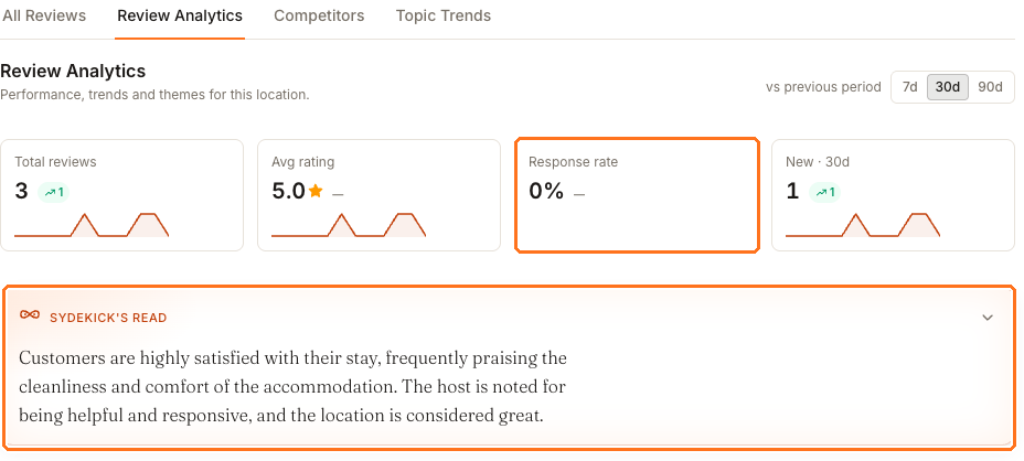
Total reviews and Avg rating describe what customers did. Response rate and
New describe what you did. In practice response rate is the one worth acting on,
because it is the only one of the four you control directly.
The orange Sydekick's read panel underneath summarises what customers are actually saying without you asking it anything — on this location, praise for cleanliness, comfort, a responsive host and the location itself. It is the quickest way to learn the shape of the feedback before you look at a single chart.
Compare yourself with the agency
A number on its own rarely tells you whether to act. vs agency average does.
The location above rates 5.0 against an agency average of 4.4 — the best in the portfolio. It replies to 0% of its reviews against an agency average of 50% — the worst.
Both are true at once, and only one of them needs your attention. A location that never replies looks unattended to anyone reading its reviews, however good the stars are, and its Review Health carries the same penalty.
If you check one thing on this page, check that comparison.
Rating, volume and response mean different things together
Those three numbers answer different questions, and reading them separately is how locations get misjudged.
- A high rating on very few reviews is fragile and not yet persuasive. One complaint moves it a long way.
- A middling rating on a lot of reviews is stable and usually more credible to a customer than a perfect score on three.
- A low response rate is the one that says nobody is home, regardless of the other two.
The location above is the first case with the third problem attached: excellent reviews, almost none of them, and none of them answered.
Where the patterns are
Once you know which number is wrong, these explain it.
- Rating distribution — whether a 4.2 is lots of fours, or fives dragged down by a handful of ones. Those need completely different responses.
- Reviews by platform and Avg rating by platform — where reviews come from, and whether one source is noticeably harsher than the others.
- Reviews over time and Sentiment over time — whether a change is a trend or a single bad week.
- What customers talk about — the recurring themes, with Topic Trends for how they move.
- When reviews arrive — mostly useful for deciding who watches the inbox and when.
Recent unreplied negatives only appears when there are some. Empty space there is good news, not a panel that failed to load.
Which time control changes what
There are two, and they do not affect the same things.
The 7d / 30d / 90d control at the top right sets the comparison behind the tiles —
that is what vs previous period refers to, and what the little arrow measures. A dash
instead of an arrow means there was nothing to compare against, not that nothing
changed.
Reviews over time has its own 3mo / 6mo / 12mo range. Changing it moves that chart only; the tiles above do not follow it.
What you can take out of Synup
Review data exports as CSV, and from the all-locations Reputation view rather than this tab. There is no PDF export of the analytics page, so a client-ready document means taking the CSV or the figures into your own template.